Colour in Film - The Work of Wes Anderson

Header Image Source: https://www.indiewire.com/2017/05/wes-anderson-movies-ranked-rushmore-royal-tenenbaums-fantastic-mr-fox-1201811293/
Thumbnail Image Source: https://www.jubly-umph.com/blogs/news/88335937-5-favourite-wes-anderson-movie-quotes
By Hannah Schmidt-Rees
With an instantly recognisable aesthetic style, the works of filmmaker Wes Anderson are more than just films. Combining unique characters, storylines, visuals and genres, Anderson is able to create a world that is completely his own. His most known filmmaking feature however, is his use of colour; not only to create visual cohesion and interest, but to communicate concepts that are deeper than you think. Using striking and harmonious colour palettes, Anderson uses colour to convey social structures, character development and the role of relationships.
As a creative tool, colour is highly influential in affecting the mood of the viewer. Certain colours can create specific psychological responses, as connections can be made between colours and moods, relationships and concepts. Similar colours can create relationships between dissimilar objects. An abundance of red can create feelings of desire and excitement, green to soothe and calm, yellow to create an aura of happiness and positivity.
As a post-modern filmmaker, Anderson references Auteurism; which is the creation of film with a direct influence from the filmmakers distinctive style. Every scene is shown through a personal filter of the filmmaker's views, experience and opinions, using visuals as a method of social criticism to encourage viewers to interpret their content in a specific way. In addition, Auteurism includes a filmmaker being involved in every aspect of the film's creation; including scouting, costuming, interior design and sound design.
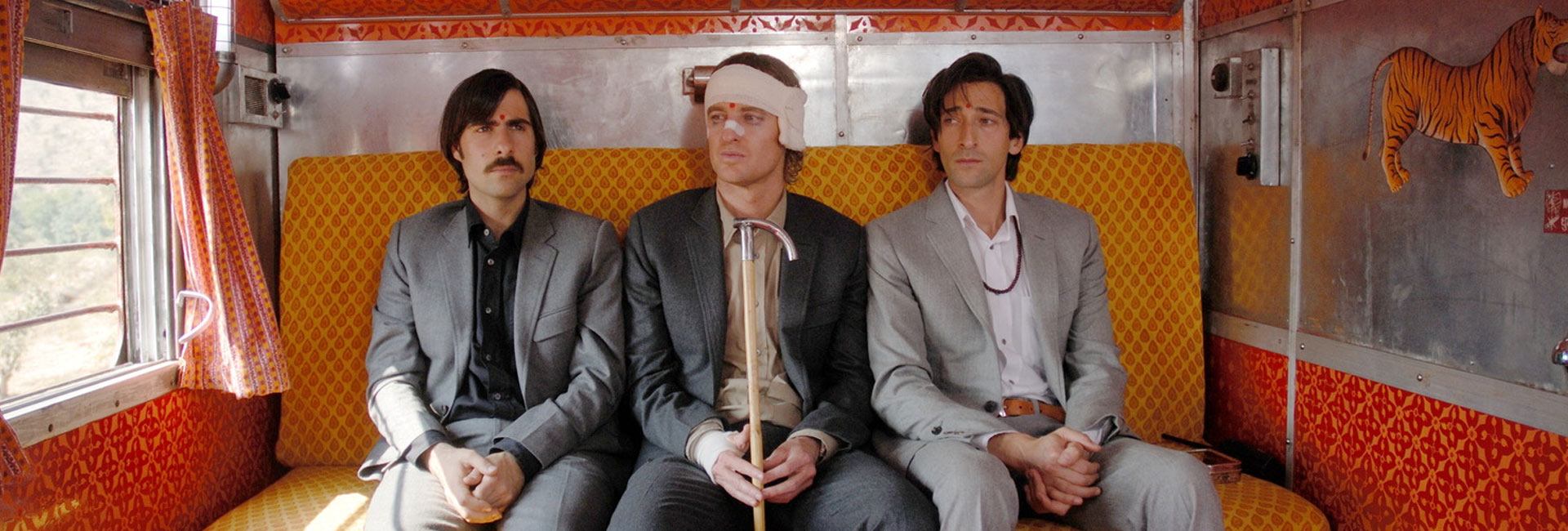
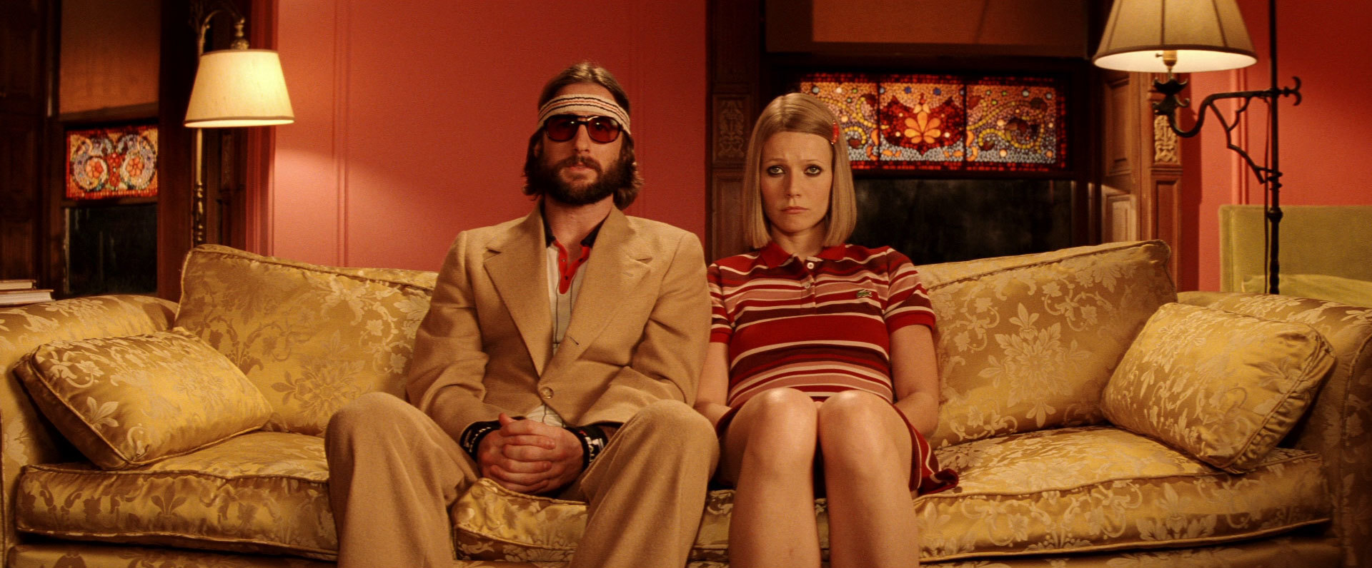
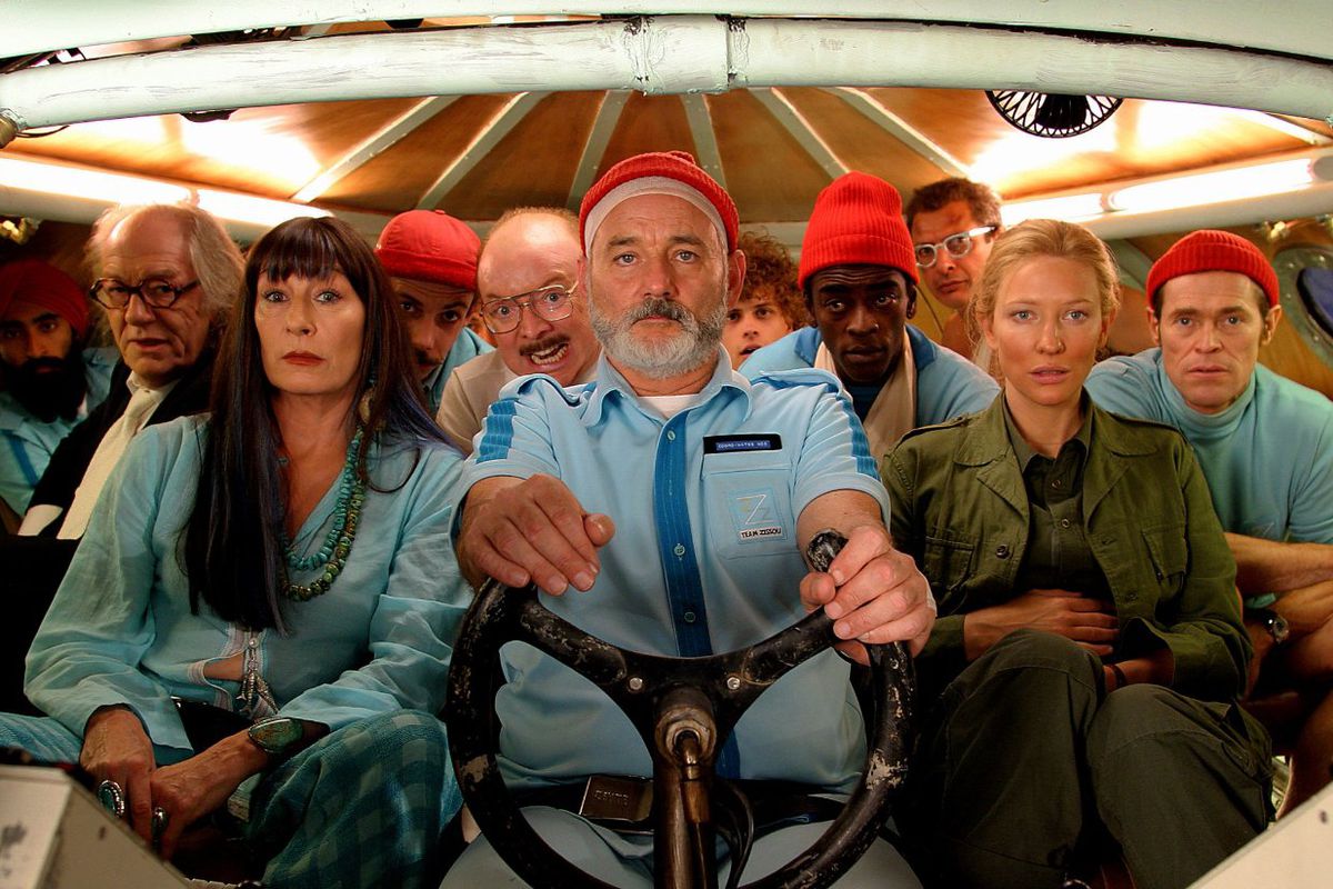
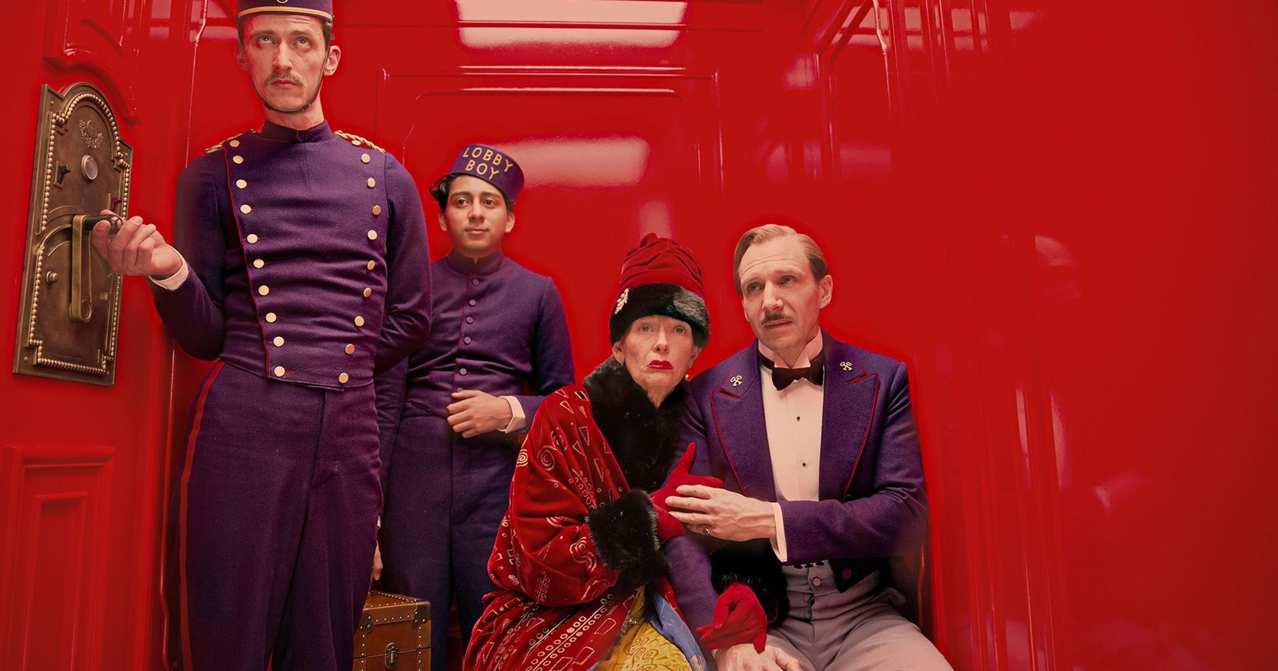
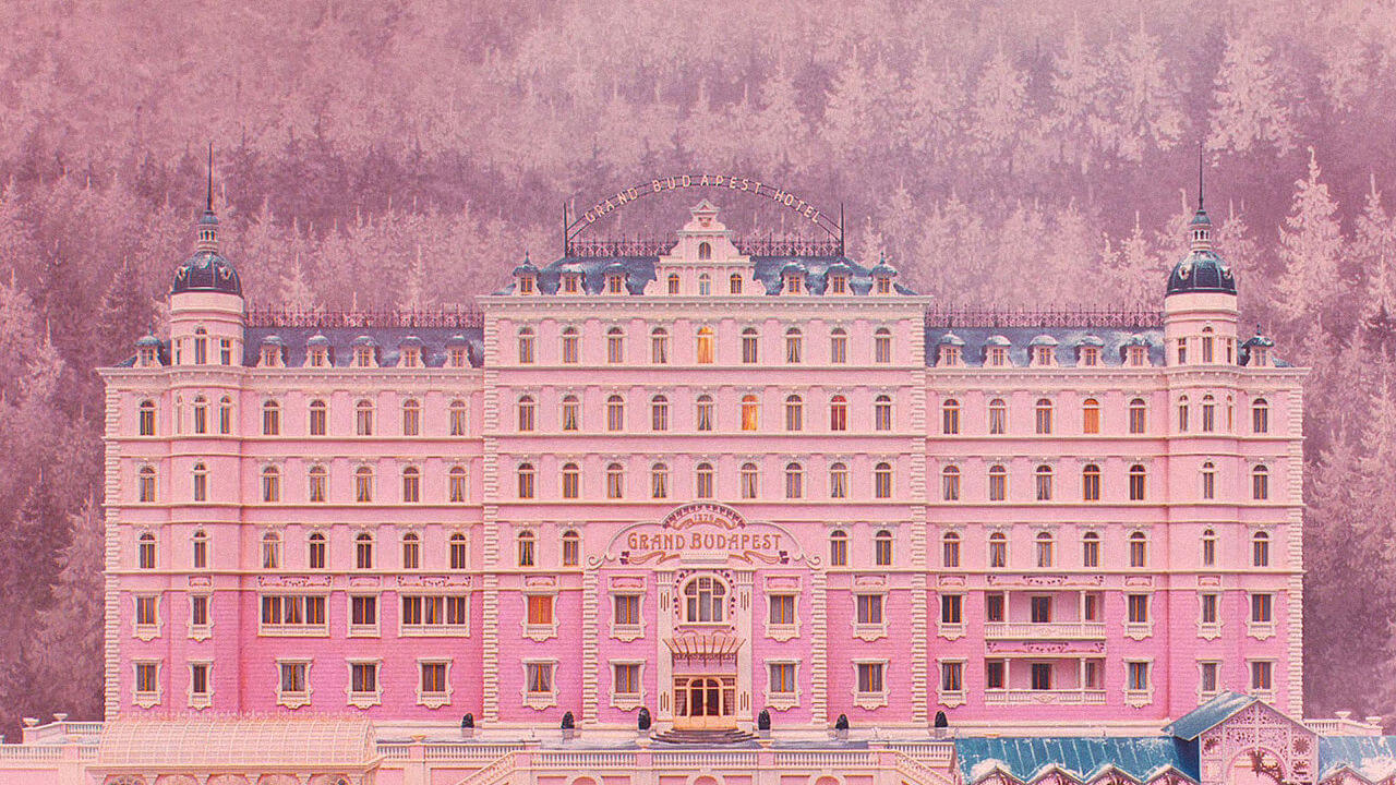
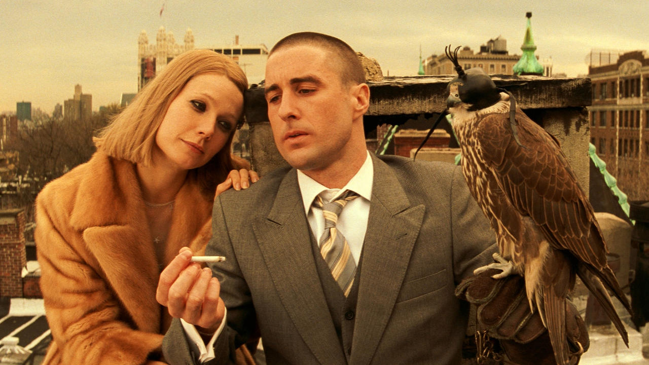
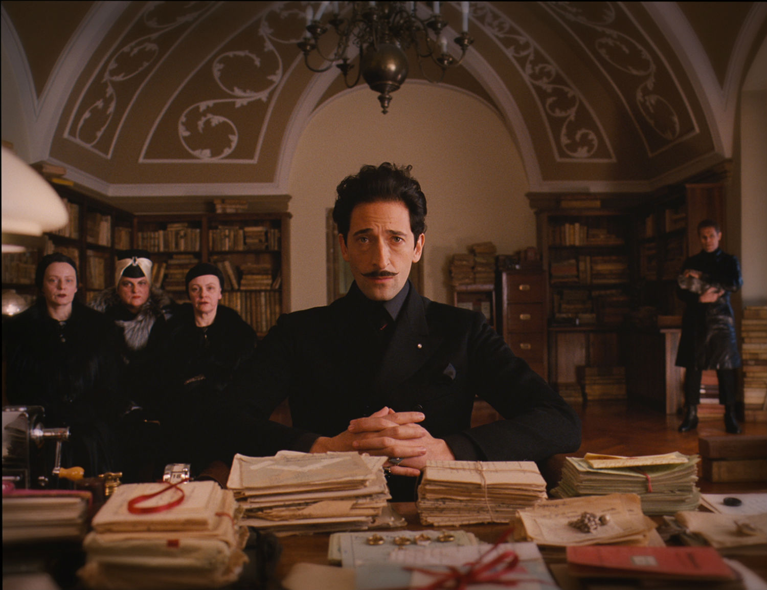
Anderson's success as a filmmaker is reliant on his use of colour. When viewing digital media, audiences often have poor colour memory, as there is very little unique visual harmony. However, even by only reading the title of a Wes Anderson film, it's incredibly easy to recall its feature colours. The rich purple, red and pink of The Grand Budapest Hotel. The unique orange, beige and pale blue of The Royal Tenenbaums. The primary red, blue and yellow of The Life Aquatic With Steve Zissou. Anderson's ability to become memorable and instantly recognisable simply due to his aesthetics are a major reason for his indie success.
“Anderson’s colour palettes are integral to his cinematic ‘world-building’. His eye for art direction and fantastic attention to detail creates the appropriate space and tone for his characters to exist in – and for the viewer to lose themselves in. They ultimately become their own visual language, the way character themes are elaborated in cinematic scores, allowing an immersive visual experience whether the sound is on or not.”
As I previously said, 'connections can be made between colours and moods, relationships and concepts'. As an example, red is used to visually represent masculinity, male adolescence and fatherhood, and yellow is used to visually represent peace and happiness.
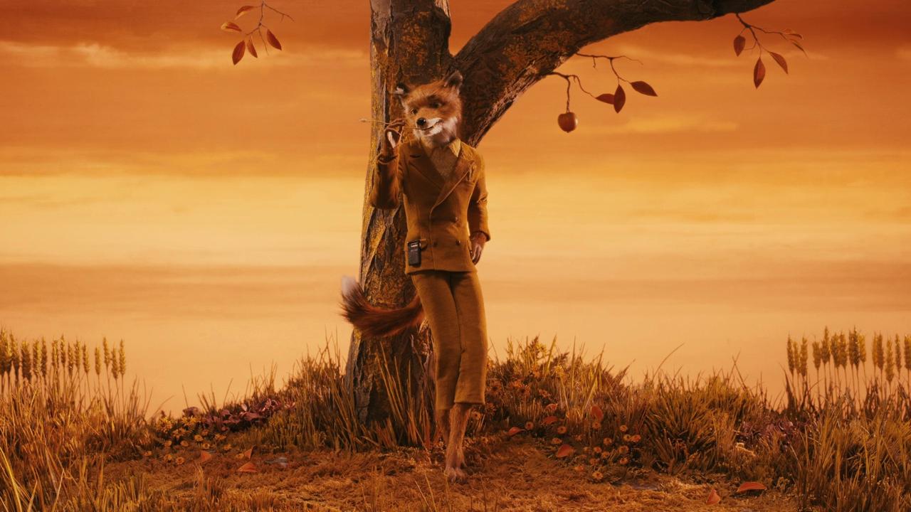
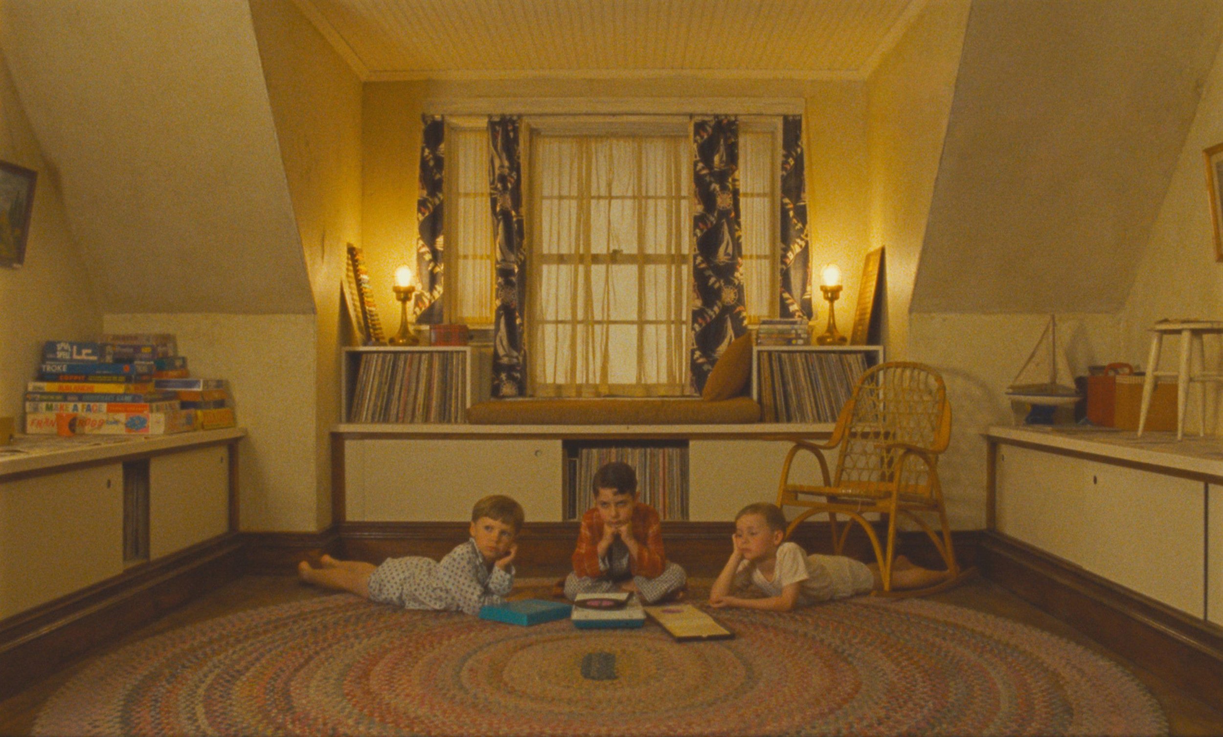
Referencing Auteurism, Anderson's childhood plays a role in the creation of his films. His parents divorced when he was eight, and he turned to creativity to cope. Many father figures in his films are flawed, with the motherly figures often not being mentioned in the film at all. In The Darjeeling Limited, the cherry red vintage car is the only object that connects the three distant sons with their father, however it represents the father's love for the car rather than his own sons. In Rushmore, Max Blume wears a red hat as he yearns for the affection for his father. In The Royal Tenenbaums, Chas Tenenbaum and (at a later point) his two sons wear matching red tracksuits as they progress from adolescence to adulthood. Fatherhood is a point of conflict and interest within Anderson's films, with the colour red being used as a visual reflection of male character's downfalls and characterisation. Yellow is used to reflect happiness and peace. In Fantastic Mr Fox, the sky is a bold yellow when the foxes are at their happiest. On the other hand, his yellow submarine is the only thing that brings Steve Zissou joy in The Life Aquatic With Steve Zissou, until he captures the yellow sea creature he’s spent his life searching for.
Anderson's use of colour creates a relationship between specific colours and concepts that he specifically wants to explore, which is a reflection of his auteuristic filmmaking style. He experienced issues with his adolescence and his father in his own life, so it’s no surprise that his characters deal with these issues too.
Anderson uses colour as way to explore adult concepts in a childlike and fantastical way. Any confrontation between characters or personal downfalls are enveloped in bright colours and rich hues. Creating worlds that combine childlike wonder with adult reality is a signature aspect to Anderson's work. Cotton candy skies and bright yellow interiors contrast with the hollow and melancholic storylines and character interactions.
Contributing to his childlike exploration of adult concepts, Anderson's specific cinematographic style is another recognisable aspect to his work. Symmetrical and flat compositions are widely used in Anderson's work. Everything is the scene is lined up directly in front of the camera, and it’s never shot at an unlikely angle. The majority of the angles used can be considered as ‘point-of-view’ shots, which only increases the audience’s immersion in the film and it’s story. Symmetry is embraced through the rule of thirds and long lenses, which makes the lines as straight as possible. The use of patterns add visual interest, with tracking shots, overhead shots and dramatic use of slow motion creating movement and adding detail to the overall mis-en-scene. Reflecting a realistic storybook take on the world, the combination of colour and cinematography creates a reality similar to a doll house. It's realistic yet unbelievable, like you’re looking at the world through the imagination of a child. The combination of dark concepts (loss of innocence, grief and loss of parental guidance) with colourful and fast-paced comedy is what makes the work of Wes Anderson incredibly unique and endearing.
Film can be used as a platform to either reflect the ideas of reality, or to create fantastical worlds as an escape. As a highly visual person, I find the use of colour is an incredibly important aspect for creative fields, especially film. I am a sucker for a when colour is used well in a creative work. I appreciate the embrace of bold and rich colours to add personality or the deliberate removal of colour to reflect emotions. And who doesn't want to watch a film that’s visually satisfying?
A film is a work of art, make it look like one.